About Access’ Ian Streets explores the growing demand for glass and how manifestations are an essential consideration of design and safety
It seems there’s growing demand for glass in the construction industry, not just for its stylish appearance but also the advantages around cost and environmental considerations.
But in getting to grips with the potential of its product, the glass industry must also be mindful of a major disadvantage. People can’t view glass in the same way as they can wood, brick or concrete. And sometimes they can literally walk right into a big problem.
You don’t have to be visually impaired to fail to see a glass door
Plenty of people have endured the instant shock and pain – and often longer term injury – from bumping into a door because they just didn’t see it.
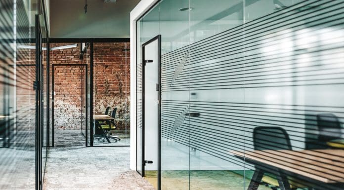
The solution – applying manifestations to the surface of the glass – is simple and can also be stylish and useful marketing support for the premises and the users. There are guidelines about the size and placement for such markings, but you’ve generally got free rein about what they should look like.
The manifestations might include corporate branding, helpful information and directions, or just images which are easy on the eye. What matters is that they do catch the eye, because that’s preferable to catching a person unawares, inflicting injury on them and others, and potentially damage to the glass.
There’s increasing versatility in the way glass lends itself to different uses – walls, windows, partitions, mirrors, balustrades, security barriers, facades. And of course doors. They should all have manifestations, and that includes automatic doors because they don’t always open when they should.
Other attributes include durability, thermal and acoustic insulation properties, ease of cleaning and maintenance and general cost effectiveness, particularly with the growth of recycling.
“Literally an accident waiting to happen”
Yet in some of the buildings we’ve visited recently, the quality of manifestation has been really poor.
Guidance in applying manifestations has been available for some time in a series of documents – BS8300 from 2018, ISO in 2021, and the European standard from 2020. It’s a good idea to work to the highest standard you can, and there’s nothing to stop you taking the best from the various pieces of guidance.
BS8300 recommends the use of permanent manifestation within two zones, from 850mm to 1000 mm from the floor and again between 1400mm and 1600 mm from the floor. The manifestation should contrast visually with the circulation space on the opposite side of the glass door visible through the glass in all light conditions. The edges of a glass door should also be apparent when the door is open.
Linked to that is the recommendation that where a glass door is adjacent to, or is incorporated within, a fully glazed wall, the two surfaces should be clearly differentiated from each another, with the door more prominent. BS6262 refers to glazed walls and makes similar recommendations.
The guidance adds that suitable manifestation is likely to take the form of a continuous or broken line, sign, logo or patterning which covers at least 10% of the glazing area within each zone.
Additional suggestions for glazed screens at counters and reception points are the use of glass which has a low light reflectance, and which is located in such a way as to not affect the ability of people who are deaf and hard of hearing to lip read through them. Glass that is silvered or highly reflective should be avoided.
The European standard goes a bit further in recommending the use of manifestation in three zones, with the heights slightly different from those recommended in BS8300 and BS6262.
Standard EN 17210 calls for uninterrupted visual indicators of at least 75 mm to be placed at heights of 900mm to 1 000mm and 1 500mm to 1 600mm above floor level, with a further manifestation at 100mm to 300mm.
The guidance also includes recommendations for the level of visual contrast, and the European standard suggests the use within the manifestations of two colours or two shades of the same colour.
Key points to bear in mind are that some designers only consider the use of glass in isolation rather than its role and location in and around a building.
They don’t always understand that regular users of a building may be familiar with the presence of glass, but others won’t. Visitors and new starters are likely to look through the glass rather than look for it.
A manifestation might not be the first thing they see, so it really has to stand out.
The post Manifestations key to a safety first approach to glass appeared first on Planning, Building & Construction Today.