Ian Streets, managing director of About Access, helps to clear the fog around how to achieve the right contrast when designing to improve accessibility
For all the importance attached to colour when designing to improve accessibility, it’s ironic that the answer might be found in simple black and white.
Correct use of colours is key, but it’s a myth that the prime consideration is colour contrast. The priority is tonal contrast, and one of the easiest ways to measure that is to go back to the basics of black and white.
There are degrees of visual impairment, and in the less severe cases tonal contrast can be a huge asset in helping people find their way around the built environment and avoid obstacles and hazards.
Understanding tonal contrast
There is greater awareness now of what can be done to make the world more accessible simply with more appropriate use of colour to help visually impaired people differentiate between objects and identify where one surface ends and another begins.
It is something we come across in most of the work that we do. It is very rare that issues don’t arise with tonal contrast, but people generally still don’t understand it.
“Around 93% of people who are visually impaired still have some vision in colour, and good awareness and application of tonal contrast will help them get around safely.”
Something can appear absolutely fine at first glance, but a more accurate picture will emerge if you carry out a black and white test.
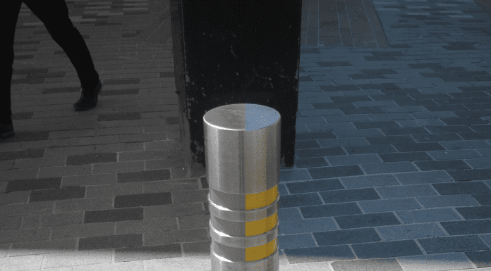
One example we looked at was a stainless steel street bollard that had a bright yellow band round the top. To many people, the yellow band will make the bollard stand out.
There is specialist equipment which will give you a precise comparison, but a good place to start is just to photograph the bollard and convert the image to black and white. You will see the tonal contrast is not very strong.
They are both light colours. You will see the yellow doesn’t have enough prominence, it can come across as white, and red would have been a better choice.
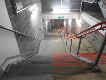
It’s the same with steps, where the use of yellow is common for nosings. That’s fine if the steps themselves are a dark colour, but the yellow won’t stand out against white or a light grey. Conversely, you might find examples of stairs that have a dark carpet and for some reason also have a dark nosing.
Difficulties can arise with doors, pieces of furniture and other fixtures and fittings. The aim has to be to do as much as possible to help people watch where they’re going and avoid mishaps, or worse.
It’s why we have tints and etchings on walls, doors and panels that are made of glass, and it underlines the importance of making design decisions based on creating something people can use in safety, rather than something that just looks nice.
The RNIB’s design principles address the need for the right sort of lighting, and enough of it for people who have low vision to view the contrasting elements.
The charity notes that at low light levels, the perception of contrast diminishes. Lighting levels should generally be relatively uniform and about 25% higher for people with sight loss.
In addition, strong directional lighting casts shadows that can mask contrasting surfaces, and significant fluctuations in lighting level can reduce visibility due to the slower adaptive response of the eye for someone with sight loss.
Light Reflective Values
In terms of visual contrast, British Standard 8300:2018 refers us to the LRV system, or Light Reflective Values. The LRV rates the amount of light reflected by the colour. The higher the number, the lighter the surface, with 0 for black and 100 for white.
Enough visual contrast will be achieved if the difference in LRV between adjacent critical surfaces is 30 points or more.
For example, in a corridor a mid-tone blue carpet may have an LRV of 40, with the walls painted in magnolia having an LRV of 75. Subtract the carpet from the walls and you have a tonal difference of 35.
Other scenarios where effective tonal contrast can make a positive difference might include tactile warning strips to indicate the start and finish of a ramp, doors, frames, skirting boards and architraves to help people find their way in and out of rooms, separation of roads and pavements, and various amenities in the public realm and play areas.
The required tonal difference of a specific location will vary depending on the level of lighting. In a bright environment of 200 lux or more, the difference might be 20 points, but where the lighting is less than 200 lux then a difference of 30 points may be required.
Another key point to remember is that outdoor surfaces such as stone and concrete may change in appearance when they are wet.
Around 93% of people who are visually impaired still have some vision in colour, and good awareness and application of tonal contrast will help them get around safely.
Ian Streets advises public and private sector bodies and businesses on accessibility legislation, issues and best practice.
*Please note that this is a commercial profile.
The post A simple test to check tonal contrast – it’s there in black and white! appeared first on Planning, Building & Construction Today.