Ian Streets, managing director of About Access, shares thoughts on the dangers of prioritising appearances over everything else
In this post-COVID era of seeking a balance between working from home and going into the office, it’s absolutely right to strive to raise the bar when designing buildings which will attract people back to their desks.
But it’s also clear that any success will be short-lived if promised “improvements” and “innovations” turnout to be superficial and no more than form over function.
“Accessibility was not part of the plan”
We’ve been assessing the design and layout of a few nice, new office buildings and what they all have in common is they look very nice – depending on your viewpoint – but accessibility was not part of the plan.
It’s clear in each case that the designers wanted to achieve a certain appearance and possibly the client – a global concern – wanted that as well, having engaged high profile and well known architects.
We’ve seen this tendency with other major concerns who like to have beautiful, statement buildings which result from the designers having been given free rein. It’s usually organisations which place a high value on the perceptions of clients. They want to look as flash as they can.
The designers in our examples would appear to have focused on that brief to the exclusion of anything else, including accessibility.
The first site we visited was totally white. That’s white floors, walls, stairs, handrails, the lot. It’s likely that most people will find it bland and uninteresting. Anyone who is visually impaired will almost certainly also find it hazardous, with the absence of any tonal contrast making it impossible to pick out the features which can help or hinder a journey through the property.
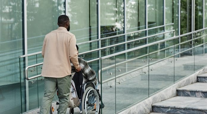
At another building the standout element was a big, grand staircase which also served to circulate the air through the building. That’s one useful attribute but the design loses points for having a very deep tread and a downwards tilt, with the result that some people were actually at risk of falling down the stairs. It didn’t help that the handrails were recessed into the walls so were not easy to use.
Another issue arose with the destination lifts. Such facilities operate as a bank of lifts, maybe six or eight. You enter the details of the floor you want at the call point and it will indicate the number or letter of the lift you need.
But the system can create problems for people who are blind, partially sighted or who are slow to move. We’re aware of cases where people have missed their lift, because they haven’t been able to make their way across the lobby quickly enough. It’s a particular concern if the space is busy, because a wheelchair user might not be seen by someone else who is in a position to hold the lift for them.
Both buildings were about appearance, not functionality or accessibility.
How seemingly minor choices can present major issues
While we’re here it’s worth a reminder about some of the other facilities and fittings which can easily be overlooked when designers become dazzled by their own creative excesses.
It’s important to note that some types of support brackets can get in the way when a person is sliding their hand along a handrail. People may be forced to release or loosen their grip or risk hurting their hand.
Also, the end of the handrail needs to extend horizontally at each end and should be designed in a manner which will prevent it from getting caught in loose clothing. Extending the handrail also provides a clue for blind or partially sighted people that they have arrived at a change of level. Note also that some people take support from the handrail before or after they start using steps or ramps.
Reception desks vary between massive and minimalist but having the correct height matters to all users, not just people of short stature or those sitting in a wheelchair. There are generally two suitable heights, one for standing users and a lower one for people of short stature or who use a wheelchair, and good practice will see these incorporated into a single unit.
Other issues we’ve found include the lock for a sliding glass door being located on the floor – at best inconvenient to operate, and for some people impossible.
Shiny, highly polished floors can also create difficulties. They pick up so many reflections and can appear to some people like a hole in the ground.
Glass doors and walls should have a manifestation which helps people to see them. That’s a good addition for glass tables as well, although placing magazines or other items on top will help.
One office had a low level plug hidden under a desk. Why?
This is just a brief, not exhaustive, list of examples which demonstrate that, however swanky the surroundings for workers settling into a new office, the enthusiasm for such premises will fade as people begin to tire of the accessibility problems which arise from pursuing form over function. The premises are only doing the job if they enable the occupants to do theirs.
The post Drive for desirable work space risks favouring form over function appeared first on Planning, Building & Construction Today.